
Maps, Charts and Statistics 2
Page 1 of 1

Maps, Charts and Statistics 2
![]() by Wed Oct 10, 2012 10:40 pm
by Wed Oct 10, 2012 10:40 pm
Maps showing correlation between progressiveness and social ills
Patterns In Data Realization: Maps Depicting Social Ills Look Eerily Familiar
Less educated areas gravitate toward mass religion and oppression.
By Def Shepherd
I'm fascinated by data realizations in map form. They say a picture's worth a thousand words.
I'm not going to make any statements about cause and effect, as we all
know that correlation does not imply causation. But there certainly is
much to be gleaned from correlation.
The below map has been making the rounds recently. It depicts the
largest participating religious groups by county in the United States --
basically which religions are most represented in each county.
As fascinating as it is, it probably doesn't come as much of a surprise:
 See that large swath of red across the South? That's the Bible Belt. It
has a lot in common with many other maps (some of which have been
discussed here before).
Here's a map depicting life expectancies for females, by county:

And here's the same for males:

Here we have a map of religiosity in America, with the darker green depicting the most religious areas:

Here we have a map depicting well-being in America. The lighter areas
indicate those areas in which residents report a lower sense of
well-being.

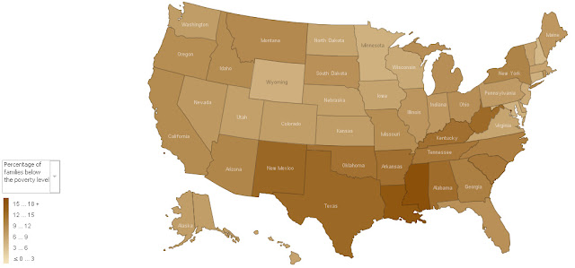
Here we have a map depicting poverty in the US. Darker portions of the map indicate higher rates of poverty.
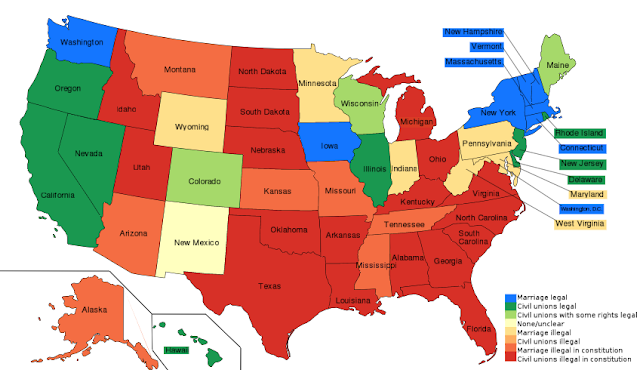
The following colorful map depicts the state of same-sex marriage in
America. The darker red states are those which are most hostile towards
gay-marriage (see key). Choosing who you want to marry is your RIGHT!
And here we have teen birth rates:
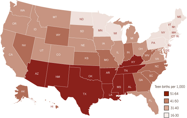
Noticing a pattern here?
Here we have a map of active hate groups:

Map showing concentrations of racist and homophobic online tweets on Twitter

The following map shows the treatment of evolution in schools, by state:

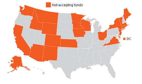
How about the states accepting abstinence education funds (those in orange denied federal abstinence education funds)?
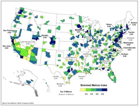
Where the Educated People Are
What about high school diplomas?

And here we have the 2008 presidential election red state/blue state map:

We are not talking about Obamacare here, a flawed plan. We are talking Medicaid and employer provided health insurance. Notice the Republican states again have the least insured! Republican representatives have as much as said they don't care if the poor die in the streets. We are not talking welfare cash so people can buy drugs and booze - I get that. We are talking basic human needs for Americans most of whom work and pay taxes but are just too poor to afford insurance. Darker states have the most uninsured.

Most persons lacking money for food

US Murder Rate & Death Penalty Link:
http://geocurrents.info/place/north-america/the-geography-of-the-death-penalty-in-the-united-states
Again, there are many, many factors that play into each of these maps.
There are certainly many complex correlations and causations (and some
factors perpetuate others). For example, we know that areas of high
poverty will likely (for obvious reasons) experience less well-being,
lower rates of education, and lower life expectancies.
The religious and political correlations, however, are more curious.
Do lower levels of well-being and lower life expectancies cause higher rates of religiosity?
Are blue-leaning states more likely to deny evolution? Or are evolution-deniers more likely to vote conservative?
Does abstinence education lead to higher teen pregnancy rates? Or do
high teen pregnancy rates lead to more abstinence education?
Are hate groups more likely to be comprised of religious conservatives?
Do lower rates of high school graduates play into higher rates of religious conservatism?
Would an increase in graduation levels decrease the number of religious conservatives, evolution denialists, and hate groups?
Valid questions all.... Do you have the answers? Please share.
Patterns In Data Realization: Maps Depicting Social Ills Look Eerily Familiar
Less educated areas gravitate toward mass religion and oppression.
By Def Shepherd
I'm fascinated by data realizations in map form. They say a picture's worth a thousand words.
I'm not going to make any statements about cause and effect, as we all
know that correlation does not imply causation. But there certainly is
much to be gleaned from correlation.
The below map has been making the rounds recently. It depicts the
largest participating religious groups by county in the United States --
basically which religions are most represented in each county.
As fascinating as it is, it probably doesn't come as much of a surprise:
has a lot in common with many other maps (some of which have been
discussed here before).
Here's a map depicting life expectancies for females, by county:
And here's the same for males:
Here we have a map of religiosity in America, with the darker green depicting the most religious areas:
Here we have a map depicting well-being in America. The lighter areas
indicate those areas in which residents report a lower sense of
well-being.
Here we have a map depicting poverty in the US. Darker portions of the map indicate higher rates of poverty.
The following colorful map depicts the state of same-sex marriage in
America. The darker red states are those which are most hostile towards
gay-marriage (see key). Choosing who you want to marry is your RIGHT!
And here we have teen birth rates:
Noticing a pattern here?
Here we have a map of active hate groups:
Map showing concentrations of racist and homophobic online tweets on Twitter
The following map shows the treatment of evolution in schools, by state:
How about the states accepting abstinence education funds (those in orange denied federal abstinence education funds)?
Where the Educated People Are
What about high school diplomas?
And here we have the 2008 presidential election red state/blue state map:
We are not talking about Obamacare here, a flawed plan. We are talking Medicaid and employer provided health insurance. Notice the Republican states again have the least insured! Republican representatives have as much as said they don't care if the poor die in the streets. We are not talking welfare cash so people can buy drugs and booze - I get that. We are talking basic human needs for Americans most of whom work and pay taxes but are just too poor to afford insurance. Darker states have the most uninsured.
Most persons lacking money for food
US Murder Rate & Death Penalty Link:
http://geocurrents.info/place/north-america/the-geography-of-the-death-penalty-in-the-united-states
Again, there are many, many factors that play into each of these maps.
There are certainly many complex correlations and causations (and some
factors perpetuate others). For example, we know that areas of high
poverty will likely (for obvious reasons) experience less well-being,
lower rates of education, and lower life expectancies.
The religious and political correlations, however, are more curious.
Do lower levels of well-being and lower life expectancies cause higher rates of religiosity?
Are blue-leaning states more likely to deny evolution? Or are evolution-deniers more likely to vote conservative?
Does abstinence education lead to higher teen pregnancy rates? Or do
high teen pregnancy rates lead to more abstinence education?
Are hate groups more likely to be comprised of religious conservatives?
Do lower rates of high school graduates play into higher rates of religious conservatism?
Would an increase in graduation levels decrease the number of religious conservatives, evolution denialists, and hate groups?
Valid questions all.... Do you have the answers? Please share.
- Join date : 1969-12-31
» Carbon Dioxide Levels Off The Charts - It's All Downhill From Here
» Local Food and Growing Maps
» Current Disaster/Emergencies Maps
» Choosing A Good State To Live MAPS
» Changing Face of America - Diversity Maps
» Local Food and Growing Maps
» Current Disaster/Emergencies Maps
» Choosing A Good State To Live MAPS
» Changing Face of America - Diversity Maps
Page 1 of 1
Permissions in this forum:
You cannot reply to topics in this forum|
|
|
